
I have a few friends and blog readers who have requested that I do a painting tutorial of some sort. Dalin also encouraged me to make one, suggesting I do kind of an art blog. I would love to be able to make my painting/crafting a regular part of this blog, but I am not sure that this is the year for that. Still, I don't want to leave those of you who are wanting painting tips hanging.
Hence, I am going to put together a brief tutorial for tonight that I will hopefully be able to build off of later and maybe do a more in-depth step-by-step post at some point in the future if you guys would like that (so let me know! Because otherwise I have to assume most of you aren't interested!).
Also, I am by no means an art teacher. I am just telling you what I do and what I have learned from taking various art classes in high school. I also have painting in my blood (my great uncles or something--Frank French and Daniel Chester French were both fairly famous artists) so I already had an advantage. Nevertheless, this does not mean you should not even try! I honestly believe that anyone can paint well if they take my basic advice offered below and of course, practice. (It's like Ratatouille--anyone can be a chef an artist!)
1. Have a Photo or Image for Reference
So to start, I thought I'd explain that painting is a zillion times easier when you have a photo for reference. I always use a picture or painting when I start. When I don't, the painting never turns out the way I want it to. I would show you an example of this, except I already painted over the last painting I did from my head because I hated it. Below I will show you three paintings I've done in the last month, starting with the reference photos that I used (aka, I did not paint the first three images below myself--I found them on Pinterest when browsing for painting/gift ideas for Christmas).
Reference Photo
 |
| "Season of Light" by Barrie VanOsdell |
Reference Photo
 | ||
| By Ovanes Berberian
Reference Photo
|

2. Prep Your Canvas if Necessary
So once you have chosen an image, you have a few options. You can just start painting, which is what I do because I've had a lot of practice, or you can very lightly pencil in the main details/ outlines directly onto the canvas. I say lightly because if you use the pencil too heavily, the pencil dust will mix with your paint on the canvas and create smudges. If you have never painted before or have trouble drawing freehand, my suggestion to you would be printing out the image you want to do and gridding it. If you do this, you will also (again lightly) grid your canvas using the same scale. Then you can use each square as a reference for what color and detail you are painting within each individual square. (I'm not sure how well I explained that, so let me know if you need clarification).

3. Start with the Background and Move to the Foreground
I think any painter or artist will give you this advice. Many a painter has learned the hard way by starting on the focal point (a tree, for example) and then having to suffer the madness of filling in and adequately blending the background against this. It is a huge pain and can be really frustrating, especially if you are new to painting. So remember, *start with the background*! If the background is a sky, a mountain, a blur of trees, and water (like the first painting below), start with those basic parts. Just *put paint on the canvas*. It is scary at first, because you might worry about messing up, but really, the first layer is almost impossible to mess up. My next piece of advice would be to *paint what you see, not what you know*. This is a hard for some people to grasp at first. You know the sky is usually light blue, but is it light blue in the picture? Is it more white or more blue? Is it pinkish or purple-toned? Very rarely is the sky just plain light blue. Look at the actual colors of the picture and forget what your brain tells you they should be.
In elementary school, they basically teach you to draw a tree that has a brown trunk and green leaves like so:
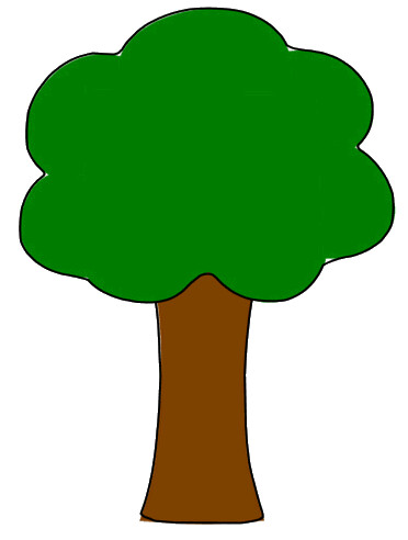
But real tree trunks are usually gray with various shades of brown, black, and white mixed in. Real foliage is not just one big green clump, but thousands of individual leaves of various shades of greens and yellows like the one below. So again, paint what you see, not what you know.

4. Create a Very Rough Draft of the Main Colors and Shapes in the Painting
Just *get the colors and shapes of things down on the canvas*. It can be hard to allow yourself to do this freely, but it will help you big time in the long run. It also makes it much easier to finalize your painting later on. Since it's supposed to be a rough draft, I usually rush through this part. I simply see that there is a lot of orange (for example) on one area of the picture and I mix up a similar orange and paint that shape on the canvas. Note that if your image has trees, you will want to at least do a basic outline of each major tree trunk and branches and also add a few blobs of color for the foliage. It doesn't have to be perfect, but you will be so grateful later on if you don't have to go through one tree at a time adding every single detail. Once all of the main colors and shapes are on the canvas, I know I can move on to the final step, which is fine-tuning the image.
I neglected to take a full "before" shot of the first painting I did, but you can get the gist somewhat from this image of a corner of the canvas. Compare these images to the final thing and you will see what I mean about these being rough drafts.


5. Fill in the Details
This is by far the most time-consuming part (as it should be) but it's my favorite because it is exciting when you begin to see your painting come together. Sometimes I am all over the place when I am adding details, but generally, I am doing as many objects of one color at a time as I can so I don't have to clean my brush three thousand times. In the painting below I did all of the tree trunks and branches in the same stretch, and then I did all of the orange leaves in the entire painting, and then all of the yellow leaves. This saved me the time of doing all the different colors of one tree and instead creating a basic image that grew clearer and clearer the more details (aka splotches of color) I added.
When adding details, really *pay attention to the shadows and highlights* you see. It may not make sense to you that a tree would appear to have a white highlight, but if that's how it looks on the image, that's what you should do. It can feel scary to add a color or shade that your brain is telling you does not make sense in that location, but trust your eyes and you will be much happier with the results. I know that rocks aren't blue, but I saw a lot of blue in the image of the rocks and so that is what I did. Paying attention to the colors you see is very important.


And that brings us to another piece of advice--if you don't already have some knowledge of color theory, it might be to your advantage to look it up. Basically, if you understand the primary colors (red, yellow, blue), the secondary colors (orange, green, purple), and color mixing, you're off to a good start.
I think though that it's also important to be aware of what complementary colors are. Essentially, they are the colors opposite one another on a color wheel, and by using them near one another, the colors will actually be accentuated more. Red, for instance, really makes green pop when the colors are near each other. When blended, the two create what I would describe as a more muted color, which in many cases, means more realistic. In the painting just above of the English lake for example, I added a little bit of red to my green paint to mute the green tones which were overpowering and "unrealistic." If you do two equal amounts of two complementary colors and over-mix your paint, you usually end up with some shade of brown.

Which reminds me--*mix your colors gently*! You might think you have way too much yellow in your green, but in real life, (or at least in art life) things are rarely one tone or color. Usually objects are a blend of many shades and colors, so you will actually find your objects look more realistic if you do not mix your paint too well. By the way, I used acrylic paint in the three paintings above which is a water-based paint (unfortunately, it still does stain clothing if you don't rinse it really well asap) and dries fairly quickly. I like acrylics because they are very cheap (like $1.00 or less per color and I only buy the primary colors plus black and white) and it easy to fix mistakes because you can paint over them. I have very little experience with oil paints yet (mainly because they cost $$$) but I am told they are very fun because the colors are more vibrant, the paint has more texture (which painters always want to create), and it dries more slowly.
Basically, when I did each of these paintings, I did them in two days (with quite a few hours given on each day). On day one, I choose my picture, then just cover the canvas in paint. I don't want to see any white spots on the canvas. I do a very basic background and then I add in the vague shapes and colors seen in the picture. On day two, I already have a good foundation, I just need to make some fine-tuned alterations and add details.
Painting is really fun and meditative for many people, me included. It should not be stressful!--even if you think you don't know how to paint or if you feel like yours is not turning out quite the way you had hoped, don't let that stress you out! Recognize that you will have your own style of painting, and you might not be as good at one type as another person. Look for your style and embrace it when you find it! You will find your paintings are much more satisfactory when you do this.
I listen to music while I paint (I get too distracted by TV or movies and it ends up taking hours longer) and even with numerous interruptions from my one-year old, I still find it soothing (but I definitely try to save painting for when she is in bed or dad is home to distract her a little). Some people need peace and quiet when they paint and that's fine, too. Whatever works for you--just figure out your style and get excited about it! Monet, Da Vinci, and Picasso are nothing alike and they're all very famous.
Oh, one more thing!--Don't forget to sign or initial your painting! Try to do it in a small, discreet place. Traditionally, I believe, artists sign in the bottom right corner, but I kind of sign whichever corner is most convenient. Other artists hide their signature somewhere in the painting. It can even be just on the side or back of the canvas, it's up to you. I also date my paintings--at least the year--on the back so I have some idea of when I did them.
Please, if you have any questions for me, do not hesitate to ask! Also I'd love to know if you would be interested in more posts about painting/painting tips/crafts, etc. I try to write what interests me but I do care about my audience. I don't want anyone to be bored to death, so help a sister out and give me some tips!
Happy painting!

such a useful post! i wish i could paint like you...and maybe with these tips, i can!
ReplyDeleteThanks, Julie:) I hope it does actually help you! I always love your comments:)
Deletethanks! for some reason, i thought blogger wasn't letting me put in comments...but apparently it went through? also, it didn't tell me i got a reply comment! so weird!
Delete